


Four tips for choosing the right colour tiles for your home
Choosing a colour scheme for your kitchen, bathroom, or any room in your home can be a difficult decision, especially with a myriad of colours available! It’s worth doing your research to find a colour scheme that you feel comfortable with (and can live with!) as well as one suited to the style of your home. We’ve put together four tips to help make the process less daunting and help you select the best tiles for your space…
1. Research
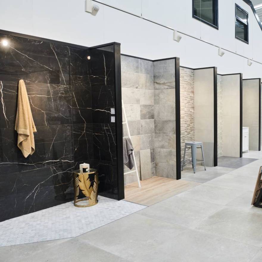
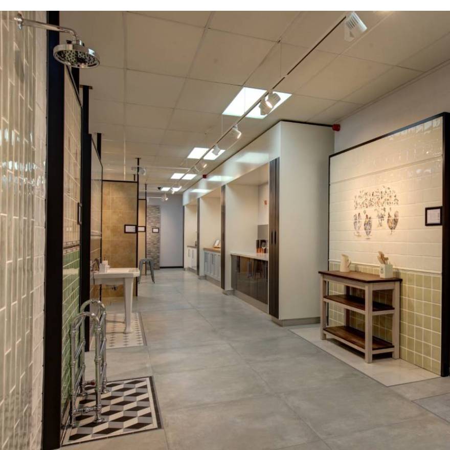
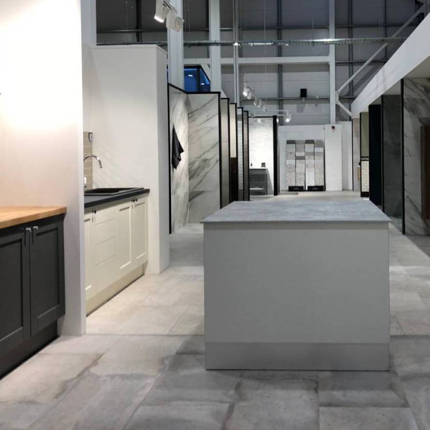
Tiles are often an afterthought when it comes to home makeovers, but they have the power to completely transform a room. After researching online, visiting your local dealer is a good place to start; here you can browse inspiring displays and get advice from friendly and knowledgeable staff, but most importantly get samples to test in your own home.
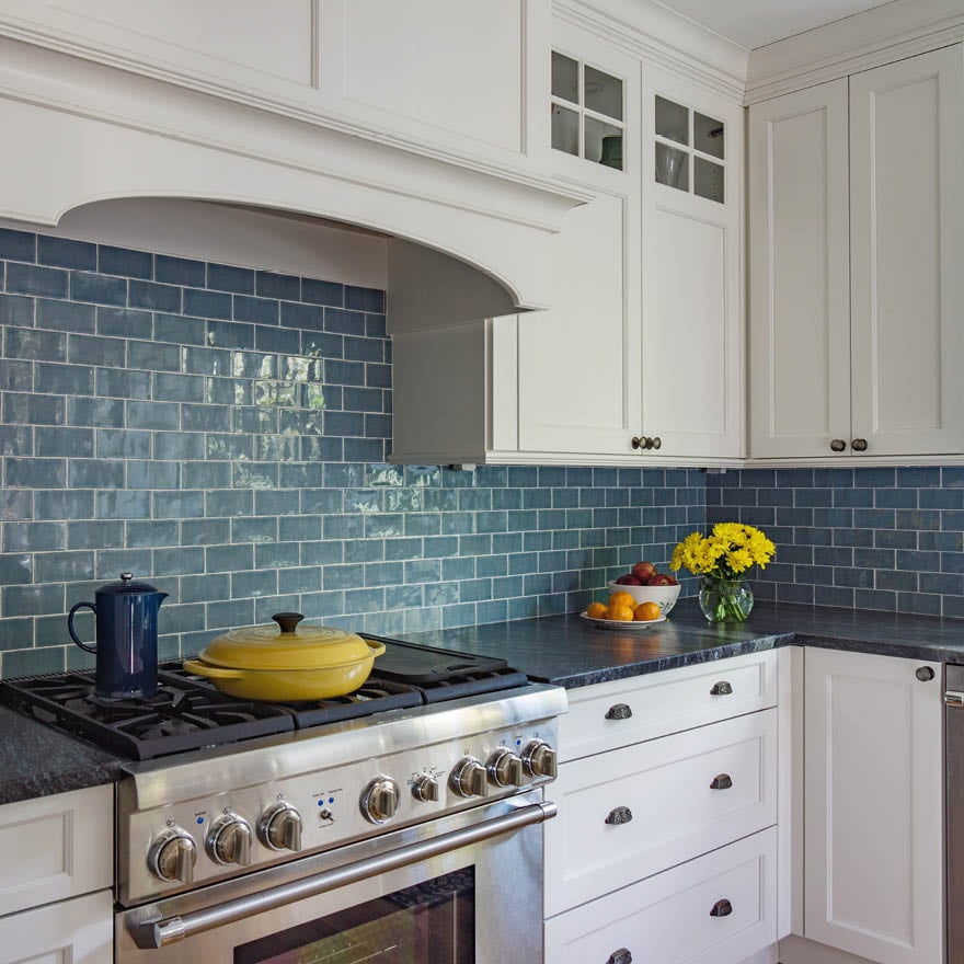
When selecting a colour there are three basic schemes to choose from, tonal, harmonious and complementary. A tonal scheme is the use of one colour but in varying hues, for some this may be too plain but adding in texture is a great way to alleviate the potential blandness of a single colour. For example if you have opted for white neutral cabinets and décor, a white textured tile like Fusuma adds immediate detail and interest. A harmonious scheme is balanced and easy on the eye, using colours that are next to each other on the colour wheel. Complementary colours are opposite each other on the colour wheel, for example pink and green. This type of colour scheme is great if you are looking for something more striking.
2. Style of property
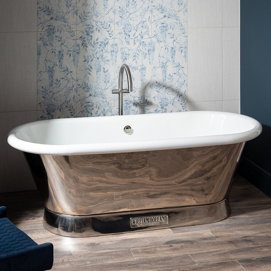
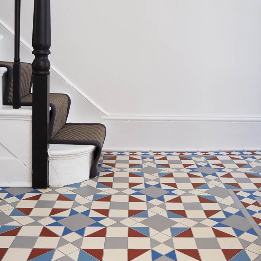
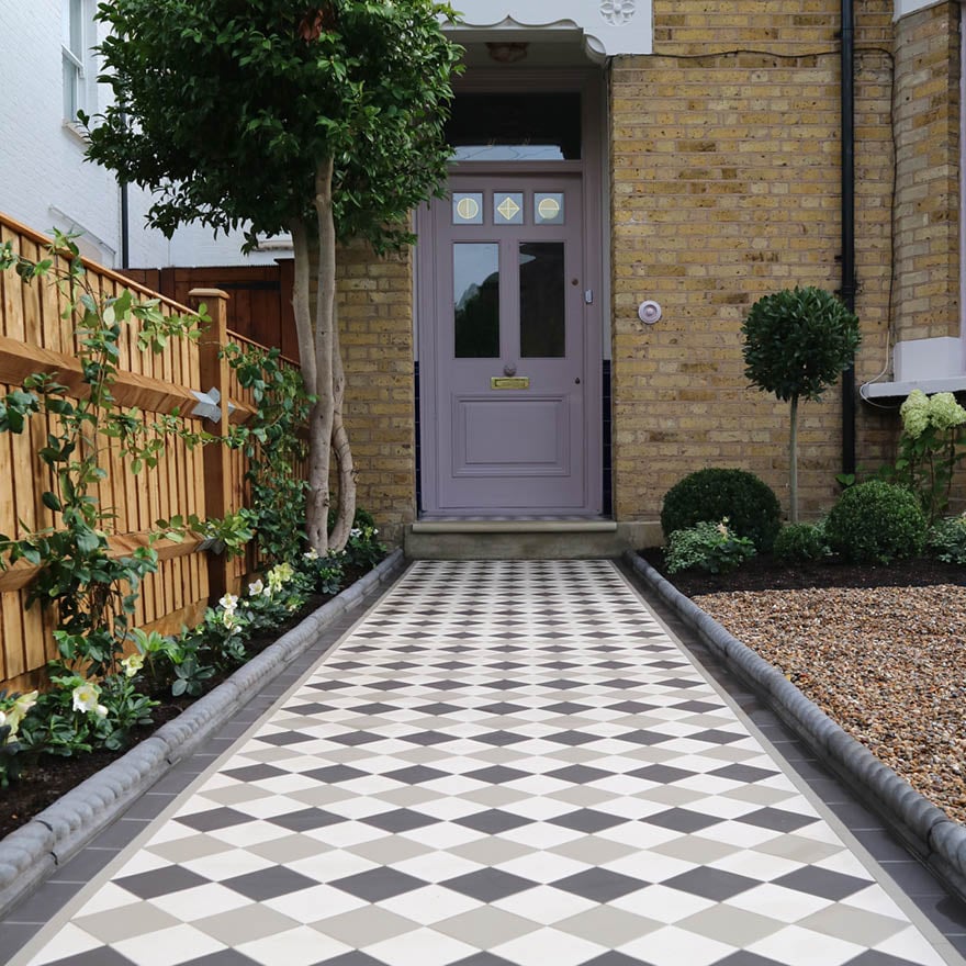
Considering the style of your home is also important when selecting colour. If you have a modern new build it may not suit traditional dark red and buff Victorian Floor Tiles, but if you love the look, a neutral colourway like grey and white as pictured below, is better suited to a new build. Likewise with period properties, applying brightly coloured jewel toned mosaics to the bathroom could look out of place, but if you want to embrace a daring colour you can still do so with the Artworks collection, try a bold Baroque Blue for depth and atmosphere.
3. Considering your space
The size of your room can also guide your colour choice, if you are updating a smaller room and want to make the most of the space, it’s common sense to opt for lighter shades. This needn’t mean white, grey or beige, using pastel shades is a nod to introducing some colour without the commitment of a bold shade. Just look at the Winchester Tile Company for plenty of pastel hues, perfect for adding a drop of colour to your interior.
It’s also important to see how tiles look in different lights, so we recommend getting samples from your local dealer and looking at them in your space at different times of the day to see how they are affected by light.
4. Finishing Touches
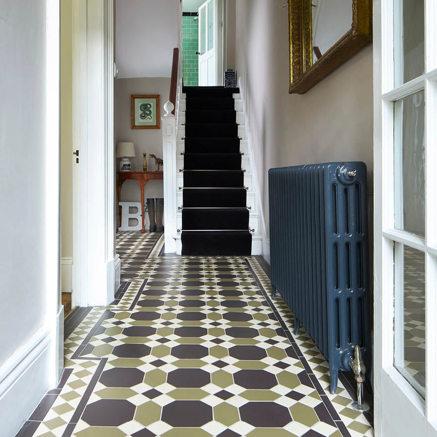
It can be tempting to match all your accessories to your colour scheme, but this can look overwhelming, if you already have a statement colour in your kitchen or bathroom try using a complementary shade for items like towels and décor. For the ultimate finishing touch, border tiles can really add that coveted wow factor; use them to frame, highlight and finish an area to perfection, or even to add a pop of colour.
Shop at a Retailer
At your local retailer you can order samples, get expert advice and browse inspiring displays. We have over 2000 retailers worldwide.
Shop at an Original Style Tile Showroom
Our flagship showrooms are welcoming, bright spaces that have been designed to help inspire our customers in a relaxed, creative environment.